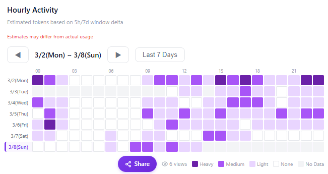
Hourly Activity Heatmap
A new heatmap has been added so you can see your hourly usage at a glance.
Key Features
- 24-hour × date heatmap — Visually identify which hours you use Claude the most
- Color intensity shows usage level — Darker means higher usage
- Timezone selector — View in your local timezone
- Available on both personal and team dashboards
How to View
- Open your dashboard
- Select the Heatmap tab in the 'Hourly Activity' section
- Set the date range and timezone to view